Space Beneath My Buttocks
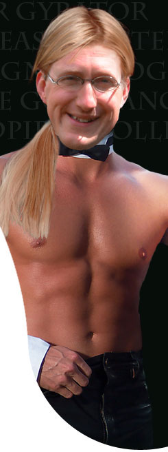
It's been brought to my attention that there's too much space beneath my buttocks. Not literally , I should add, but in terms of yon large pink cheeks at the top of this page. I've just spoken to Big Frank on the phone and he assures me that he can either drop the buttocks an inch or lift the rest, though it might take some time. Buttock adjustments are not something you undertake lightly.
So far, I believe Mopsa doesn't mind the new look and Mr. Blister prefers the old design. Hardly the ringing endorsement I'd hoped for and I'm beginning to worry what Big Frank will say when he reads the comments.
What say the rest of you Thonglateers? Should I can the buttocks and Bigger Big Chip?
![]()


10 comments:
Chip,
If you can get the first post to start just below the bum, it will look great.
yeah! For those with glasses - use them! Great Chipster. Slick, sleek, sly and slips down easy.
Chippy, I think is absolutely fabulous sweetie ...
Steve, yet I've got the men working on the buttocks as I type. Hope to have it fixed in the morning.
Mopsa, I knew you'd appreciate the buttocks. They are a class apart.
M&M, I'm so glad you like it. You should see what we've had done to the kitchen...
Chip it's looking better, but it needs to be higher still. Think Greyhound - about an inch away from the hair.
Steve, I'm cursed by the curvature of the buttocks on the one hand and the right-hand panel. The higher I move the text, I get a white box cutting into the right hand picture.
It's nip and tuck but I'll get it there. It's worth the work to have a pair of large buttocks as my blog logo.
Looks good now.
The buttocks are indeed a brave move! I find myself wishing your darling tattoo was at a slightly different tilt - with the point of the heart a bit to the right - so that the top of the design would be a little more aligned with the curve of the thong...
Otherwise the whole thing made me gasp!
Maybe not so good for people who might be reading you illicitly, or in a public place...
Steve, thanks. I think it's nearly there. You need to say, however, more with a slight pressing motion of your hands: 'looookkkiiiiinnnngggg gooooood'.
Ms. Baroque, the positioning of the tattoo has caused much argument in the Chipster's home in the last week. It might looked better with a slight tilt. I'll see if I can get it altered...
Might make you a bit not safe for work but 'm sure once I explain its only the blog of Wales top stripper and literary critic I'll be OK.
Looks great.
Post a Comment