The New Look Diary
You might have noticed that I’ve changed the look of my blog. The alterations are subtle but in-keeping with the friendly atmosphere I like to encourage.
All I have to ask is: do you think it too much?
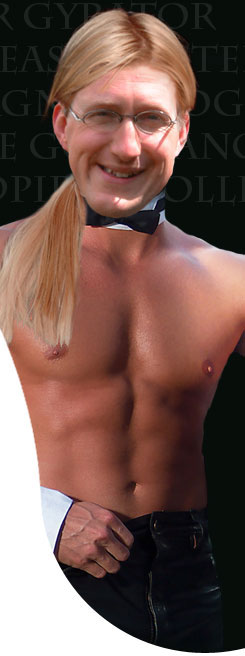
UPDATE: I’ve just come off the phone with Big Frank, my web designer. I told him he’s done a pretty good job, though I admit that I think he’s gone a little overboard with the size and number of buttocks at the top of the screen.
I don’t suppose I can blame the man. And I’m just grateful that he’s made the site look less derivative than it did before. I consider it the best £50 of pouch money I’ve ever spent for a customized Blogger template. It’s certainly better than the last person I paid. As you probably know, he lifted most of his ideas from a certain well known blogger which has precipitated this earlier-than-anticipated redesign.


5 comments:
Very posh Chippy. It certainly smacks you in the eye, there aint a hint of derivation and you have accommodated your visually impaired readers beautifully. The only drawback I can see is that the larger the font, the shorter the blog, or the scrolling finger gets tired - and you are not a short blog kind of guy.
Can I be the killjoy and say I prefered the old one. I too prefer a smaller font, plus there appears, to me at least, to be too much white space beneath your buttocks. Before the words start that is.
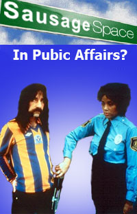
Glad to see you've kept the picture of Derek Smalls in his Shrewsbury Town shirt though.
Can't wait to read the novel.
Chin chin!
Montegue Blister
Thanks Mopsa and Mr. Blister.
The bigger font is now a smaller font, which should mean it's the same as it used to be. I always thought it a bit hard to read but it might just have been my rather large monitor. Hope this is better.
Mr. Blister, do you really prefer the older one? Ah, well. I'll have to see what others think and I can always go back to it if it's a disaster. As to the space beneath my buttocks, I'll see what can be done. I know what you mean though... I hate to see too much space beneath a buttock.
I think I would be quite happy with your new design if you could just eliminate the white space. To be honest with you Chipster I only visit your blog to look at the Google Ads. It always makes me laugh to see which ads Google thinks are appropriate for your blog's content and readership.
Chin chin!
Montegue
'To be honest with you Chipster I only visit your blog to look at the Google Ads.'
Montague, you're suffering from an acute case of foot-in-mouth syndrome. You really only come here to see the Google Ads? I feel slighted and so do my buttocks. ;o)
Post a Comment